
Designing an insurance MVP that users actually trust
FinTech · Insurance · Mobile MVP · UAE Market · 2024
Insurance in the UAE is broken for users — complex policies, upfront payments, and zero visibility after purchase. FinMate reimagines this as a mobile-first BNPL experience, letting users explore, split, and track insurance in one place.
Lead UX Designer — end-to-end, from research to shipped UI
Android, iOS
Figma, Miro
0 to MVP


Imagine needing to protect your health, car, or home — but being forced to choose a complex policy with no support, upfront payments, and zero visibility after checkout.

A competitor audit of local and global BNPL and insurance platforms confirmed the gap — and led me to a central research question:
"Are users in the UAE being given real control over their insurance — or just the illusion of it?"
The research revealed four critical gaps in how insurance apps currently serve users:
1
72% – of users say they don't fully understand what their insurance covers.
2
80% – of apps do not offer any visibility into a user's active policy after purchase.
3
Only 1 in 5 – apps provide built-in installment flexibility; most redirect to third-party BNPL tools.
4
$2.45B – the size of the BNPL market in the UAE alone, yet insurance is largely excluded.
These weren't just statistics. They were design opportunities.
User Voices
To go beyond market data, I spoke with real users and reviewed app store feedback and fintech community discussions across the UAE. The frustration was consistent and loud.

Three themes emerged consistently: lack of post-purchase visibility, confusing payment structures, and zero in-app support when things go wrong. These became the three pillars of FinMate's design.
Research revealed more opportunities than an MVP could solve. So I prioritised ruthlessly — focusing on the three highest-impact problems: policy visibility, installment tracking, and post-purchase clarity.
Core user needs
A central place to view, manage, and stay informed about their insurance without having to call or email for help.
A clear timeline of installments, upcoming dues, coverage links, and alerts — especially for something as critical as health or car insurance.
Before any screens, I mapped the full user journey — identifying key decision points, edge cases, and opportunities to reduce unnecessary steps.

Brainstorming & early exploration
Research findings went straight into paper sketches — rapid, low-commitment exploration of onboarding flows, payment summaries, and policy tracking before any digital tools.
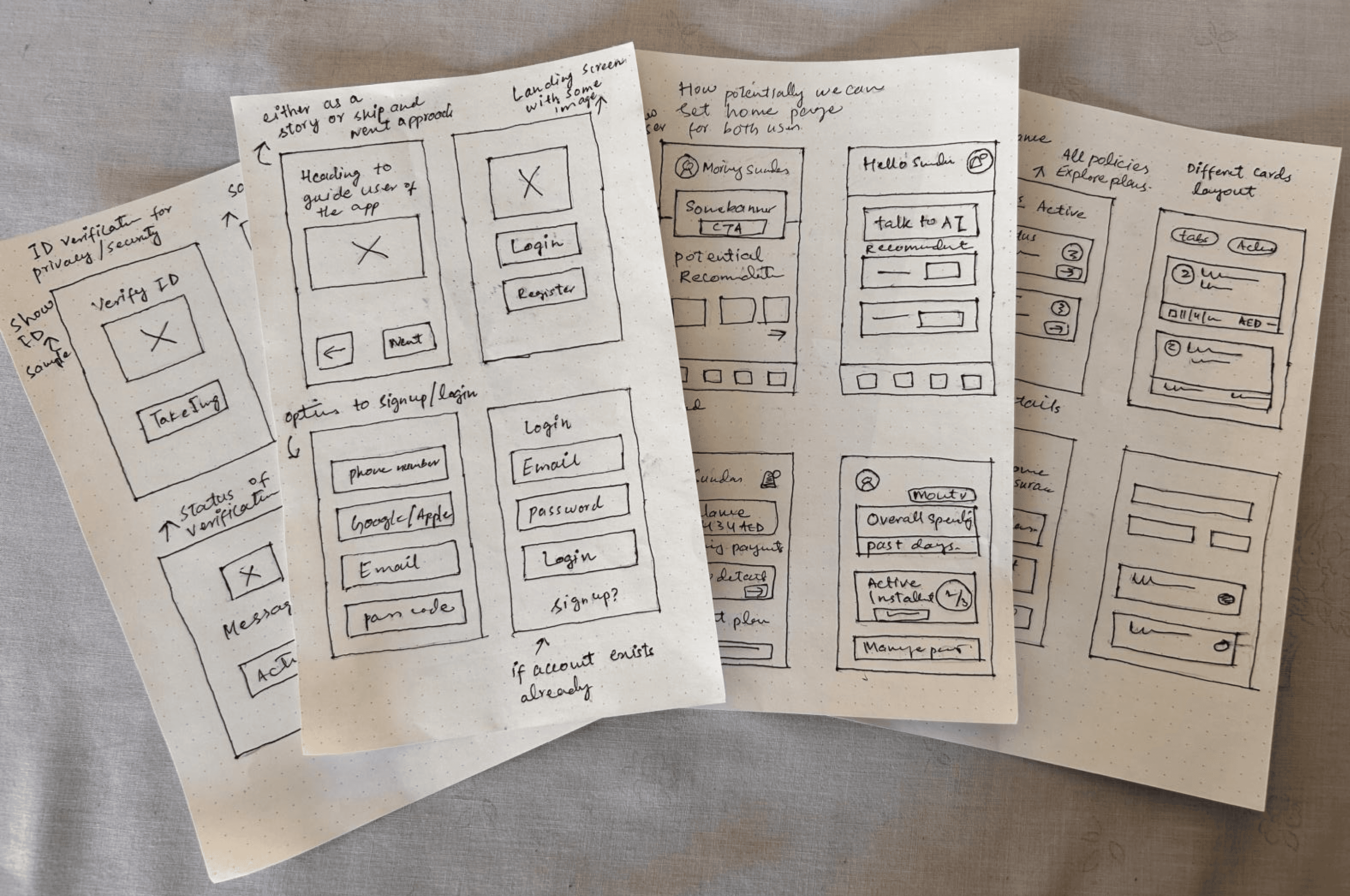
Low-fidelity wireframes
Sketches evolved into structured wireframes covering every core journey — onboarding, sign-up, identity verification, home dashboard, policies, and payments.

Design language
A modular design system built for scale — covering colour, typography, iconography, components, and accessibility from day one. Designed to reduce design debt and support future feature development.


Payment flexibility was a core user need — the "Extend due date" feature directly addresses the top frustration from research: missing payments due to rigid schedules.
Policy details consolidated into one view — status, due date, documents, and claims. No more emailing support to find out what you're covered for.


All active policies in one card-based view with instant payment access. Directly solves the post-purchase visibility gap identified in research.
What users have to say
We tested with 5 users via Maze, completing three core tasks — tracking installments, viewing active policies, and initiating a new policy. Here's what the data showed:
