
Designing for inclusion, not as an afterthought
Disabled graduates in the UK face significant employment barriers — yet most mentorship platforms were built without them in mind. The design challenge was to create an inclusive platform that works for users with a wide range of disabilities, connecting students to industry professionals in a way that feels empowering rather than patronising. This meant accessibility wasn't a feature to add at the end — it had to be embedded in every design decision from the start.
Lead UX/UI Designer — User Research, Wireframing, UI Design
Web-based
Figma, FigJam, Maze
2 months
Goals
Design an accessible mentorship platform
Match students with mentors who share similar lived experiences
Ensure inclusive interactions
Provide tailored mentorship
Create a scalable and modular design
Research
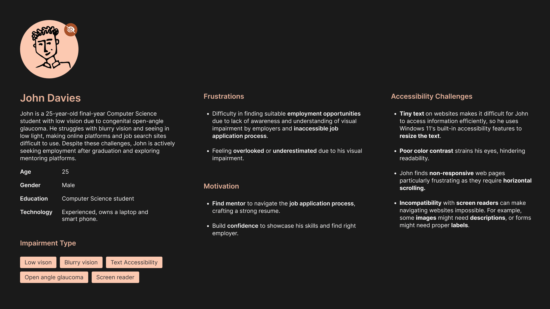
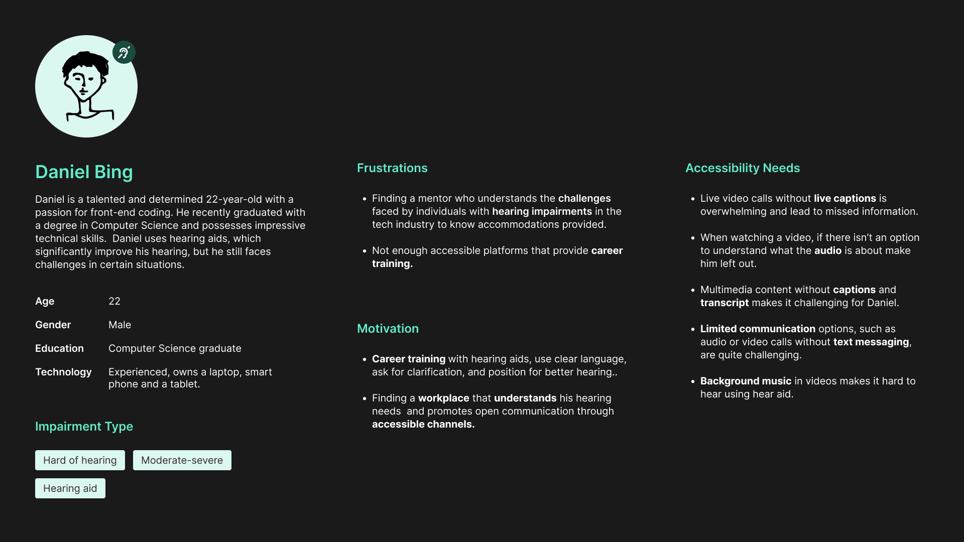
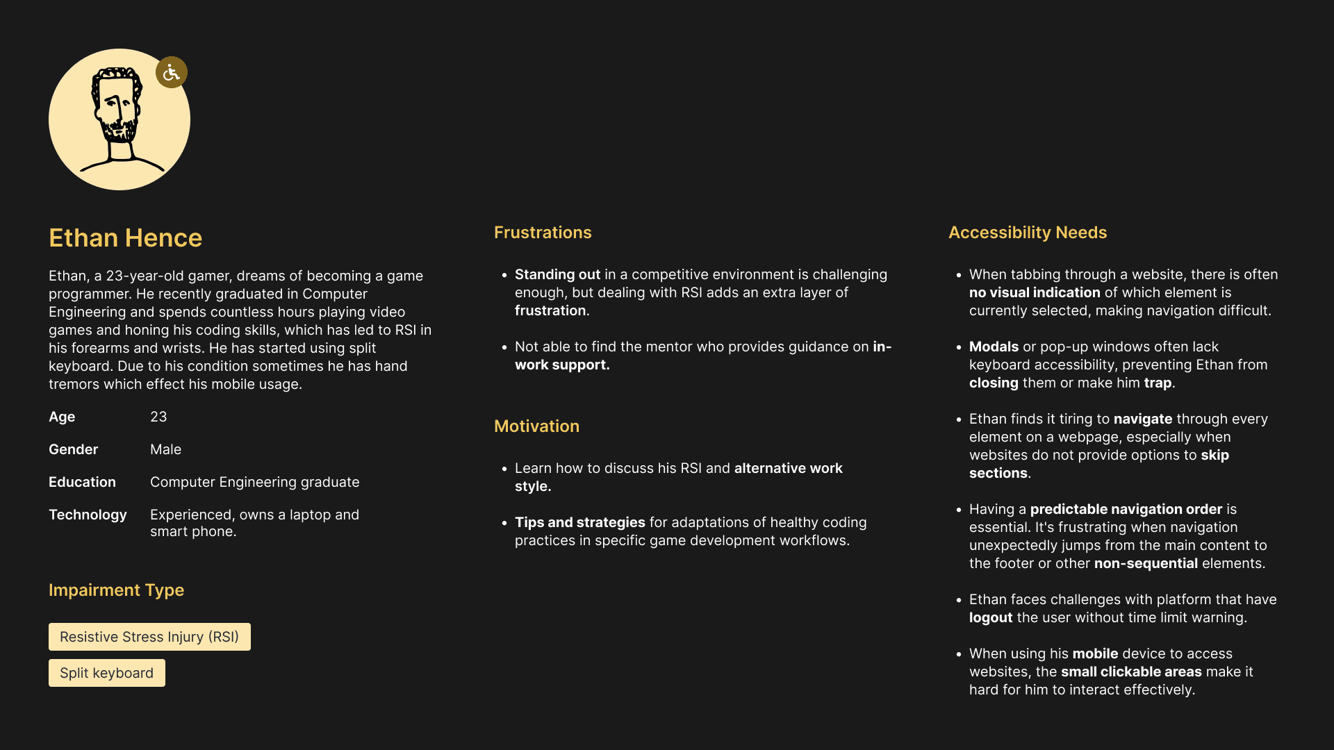
Before designing anything, I needed to understand the real barriers disabled graduates face — not assumptions, but evidence. I conducted secondary research into UK disability employment data, reviewed existing mentorship platforms for accessibility gaps, and mapped out the most common pain points through user interviews and online forums.

15%
UK university students have
a known disability
73%
Employment rate for disabled graduates after
18 months (vs. 78% for non-disabled)
5%
Employment gap between disabled and
non-disabled graduates
Every screen you see here traces back to a real user from the research. The dashboard gives users a predictable, anxiety-free next step. The mentor matching surfaces relevant people immediately, reducing the overwhelm of searching. Trust signals are placed high because accessibility-first users need confidence before they engage.


Most platforms ask for everything upfront. We don't. Each step of the onboarding collects only what's needed in that moment — career path, focus area, disability accommodations, and mentor preferences; so users never feel overwhelmed before they've even started

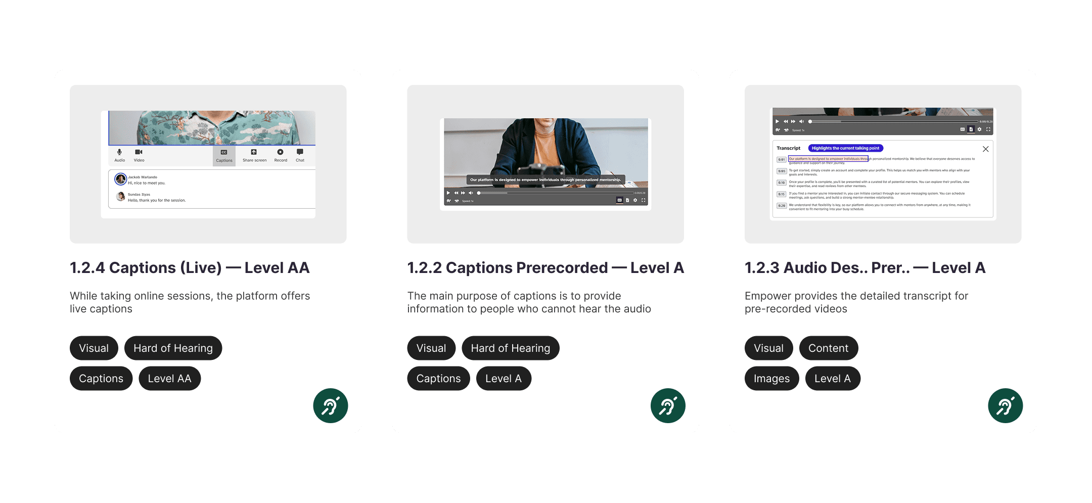
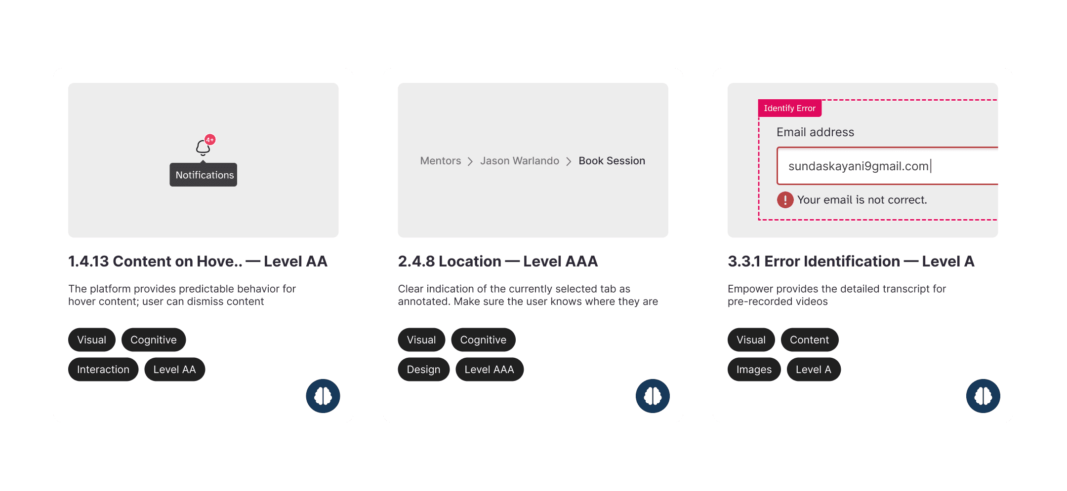
Compliance isn't a checkbox, it's a starting point. I audited the platform against WCAG 2.2 across 12+ criteria including colour contrast, keyboard navigation, focus states, form labels, and audio descriptions. Every failure was a design decision to revisit, not ignore.


Design system
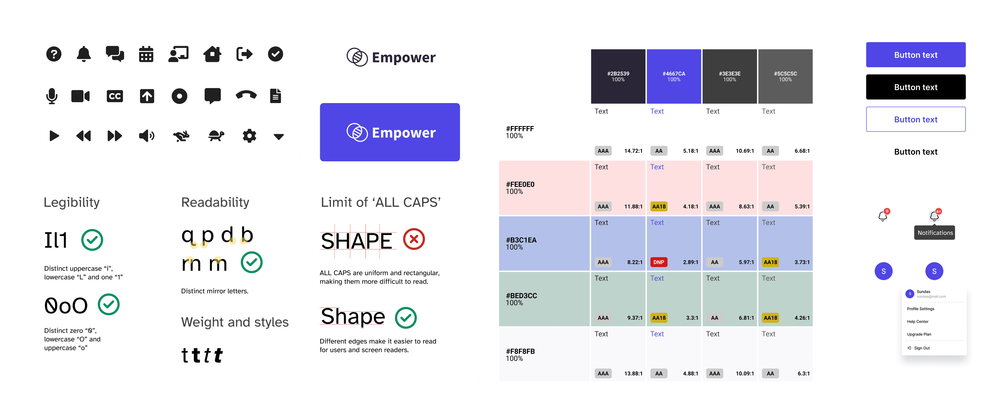
Before building screens, I built the rules. Typography tested for legibility with low vision users. Colour contrast verified at WCAG AA and AAA levels. Icons chosen for clarity, not decoration. A consistent system means every new screen inherits accessibility by default — not by accident.
Finding the right mentor
The most important moment in the platform — and the most dangerous one to get wrong. A bad match wastes time and kills trust. So I built filtering by role, accessibility needs, and skills — not just area of expertise. Users can find someone who gets their specific situation, not just someone vaguely relevant.


Through rigorous usability testing with students from diverse disability backgrounds, identified critical friction points and refined the platform iteratively. Improvements were made across visual clarity, navigation, and assistive technology support—resulting in a more inclusive, intuitive experience that better meets real user needs.
